The success of my curve building exercise for platinum/palladium printing filled last weekend with making negatives and new prints. It also made me curious about just how well the new curves would work with my, not very successful, cyanotype over platinum prints. Since I had some small, cut-off, pieces of paper left, I decided to try again. The timing was perfect, I could coat and develop them along with the larger prints, saving chemistry and time.
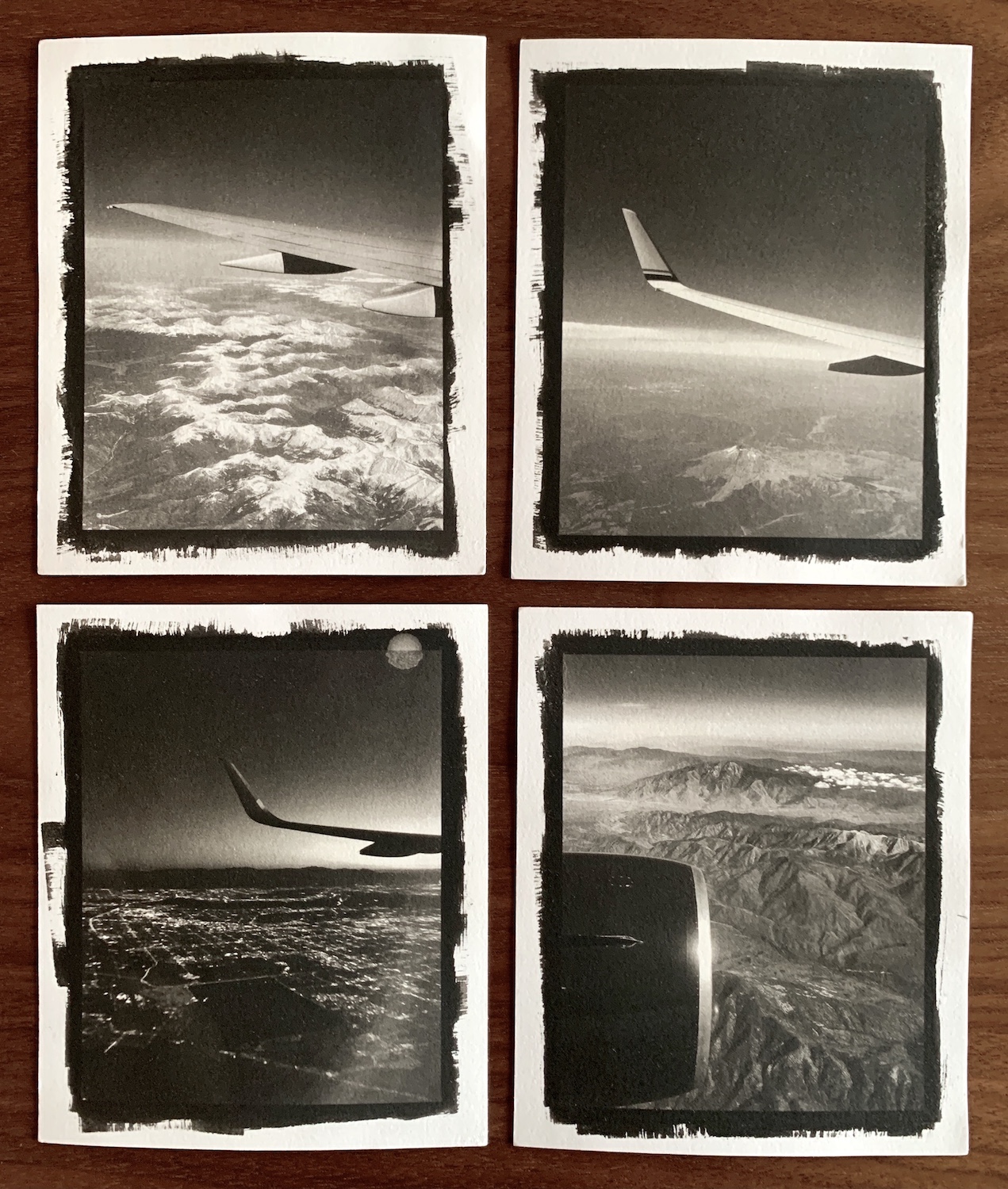
The images I chose for this experiment are all from my iPhone, taken on flights for work or vacation. I have dozens of similar photos which are, oddly, all portrait orientation and all from the port side of the aircraft. I edited them down to twelve images which turn out to be quite a nice series of photos. Anyway, here are four that I decided to experiment with.
The first step is to make the digital negatives. I cropped all of the images to a 4×5 aspect ratio and made 4×5 negatives for the contact prints. I coated the paper with the excess solution from my larger prints and made the Pt/Pd prints. After drying overnight I realized that I’d skipped a step, I did not pre-shrink the paper before making the prints. Oops. Hopefully the registration of the negative and print would not be too far off during the cyanotype process. I also spilled a drop of coffee on one of the negatives like a knucklehead.
The next day I single-coated the prints with cyanotype chemicals and let them dry. My worry about the print and negative registration was for nothing. Apparently, the Hahnemuhle paper is pretty stable and any shrinking was negligible. I exposed the prints for my standard time since I had not done any experimenting with cyanotype and the new negatives. It all worked out very well!

Here are individual iPhone snaps of the prints. They do not do them any favors. The iPhone really accentuates any texture on the paper and makes the prints look “grainy” somehow.

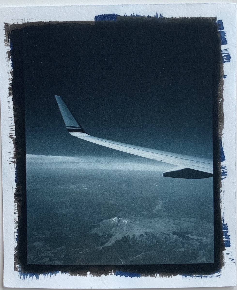


My takeaways from this little experiment are positive. The new negatives work very well for cyanotype, holding detail well in the highlights and shadows. The contrast and tonality are perfect and the deep, dark blue is exactly what I wanted. The texture of the paper is excellent, silky, and smooth. Combining the two processes gave me the dark, moody feel I had hoped for and I really like the look of the prints.
Since platinum/palladium printing is a bit expensive, I probably won’t be doing this very often, but I started down this road with one particular photo in mind and I’ll work on that print soon.